Car Details Page
Closing the 30% mobile conversion gap
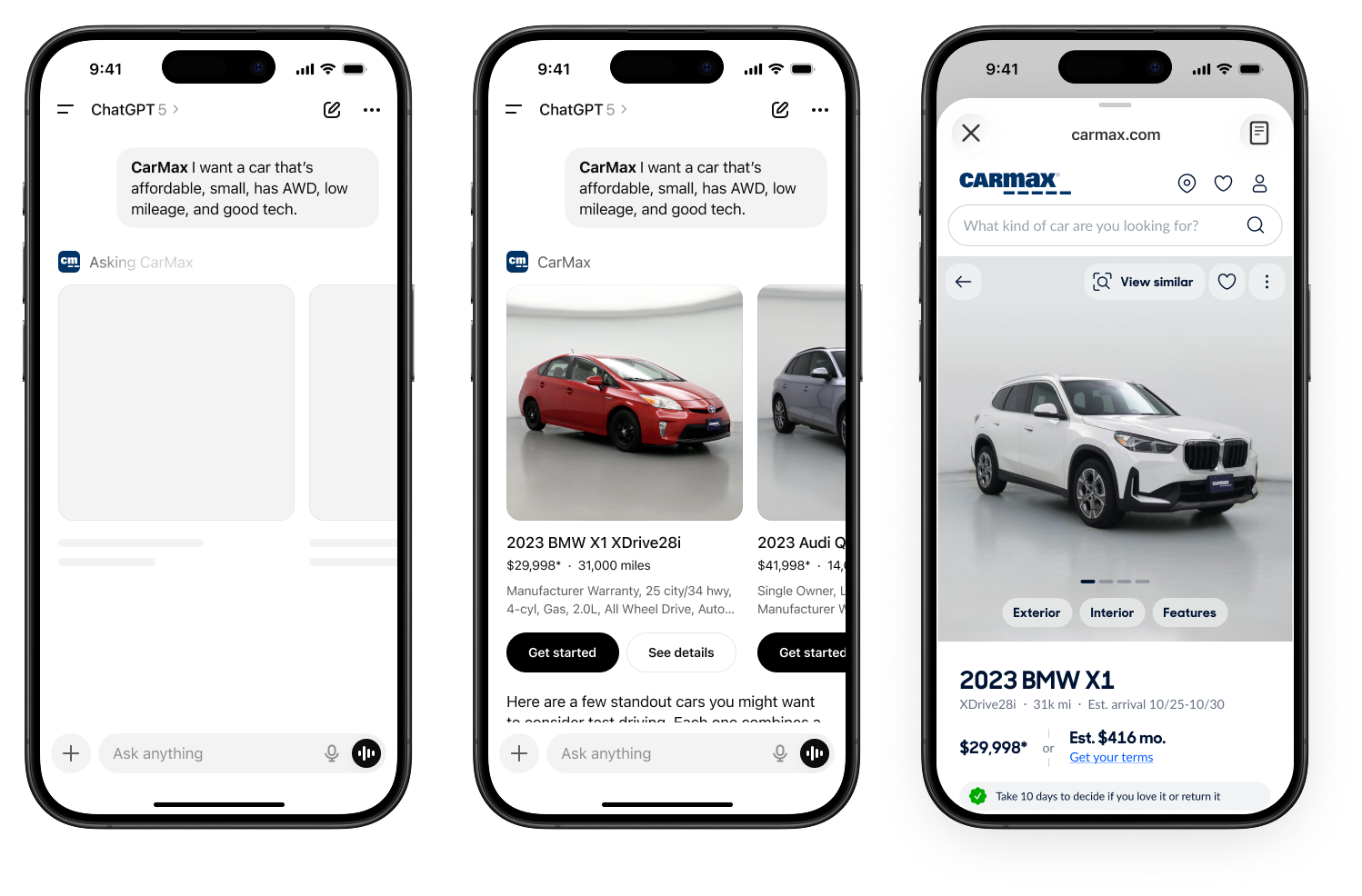
I redesigned CarMax's car details page for mobile with a single purpose: let the car sell itself. The page had a 30% mobile conversion gap versus desktop. A previous experiment adding a sticky "Get Started" button got more clicks but not more leads—people needed confidence, not just a button. The page had been optimized piece by piece, each section tethered to a different part of the business, everything competing for attention when users just needed to see the car. Through research, I learned what users actually cared about, then did a top-to-bottom product design using our design system components: remove clutter, surface trust, make the car shine.
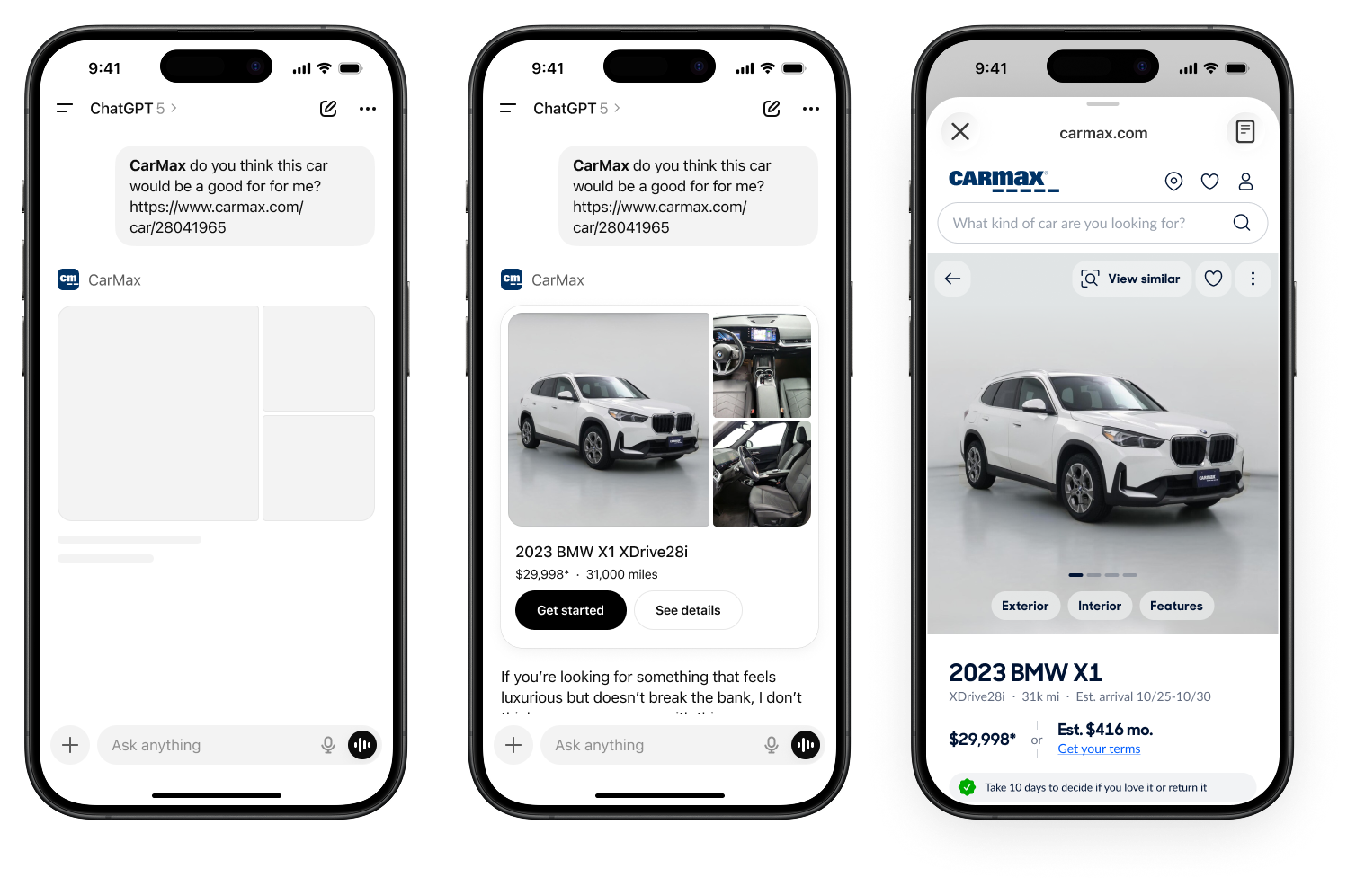
Dynamic Header & Reserve Bar
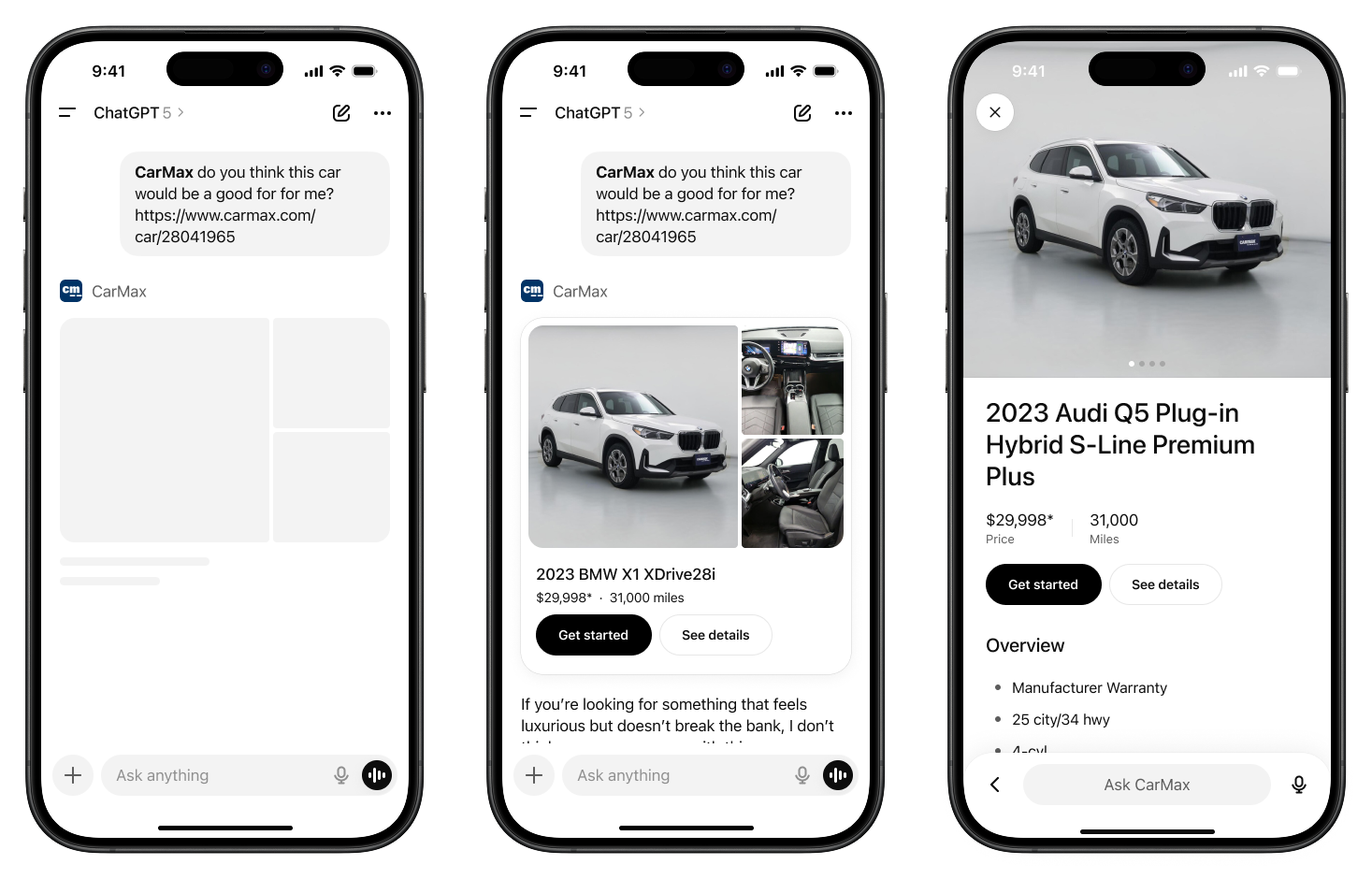
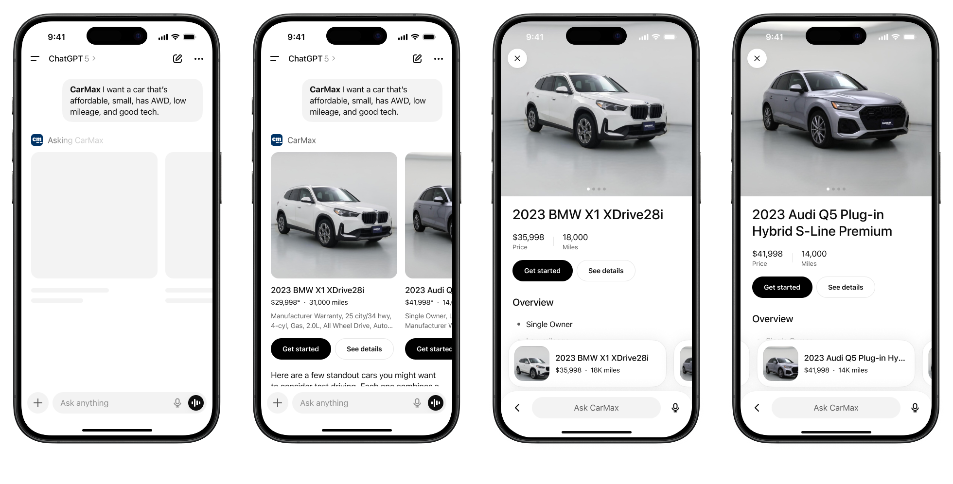
48% of users never even saw the "Get Started" button. The header was cluttered and confusing. Add the browser's own UI on mobile, and users saw a lot of noise before they even saw the car. I stripped it down to just four elements: back, logo, like, share. I replaced the bottom nav with a sticky reserve bar showing reservation options and a "Get started" button. On scroll, the logo swaps to the car's name and the text updates to show shipping cost—small reassurances to reduce friction. Tap the button and you get a sheet with three fulfillment options, one preselected to reduce decision fatigue, and a clear "Select and continue."
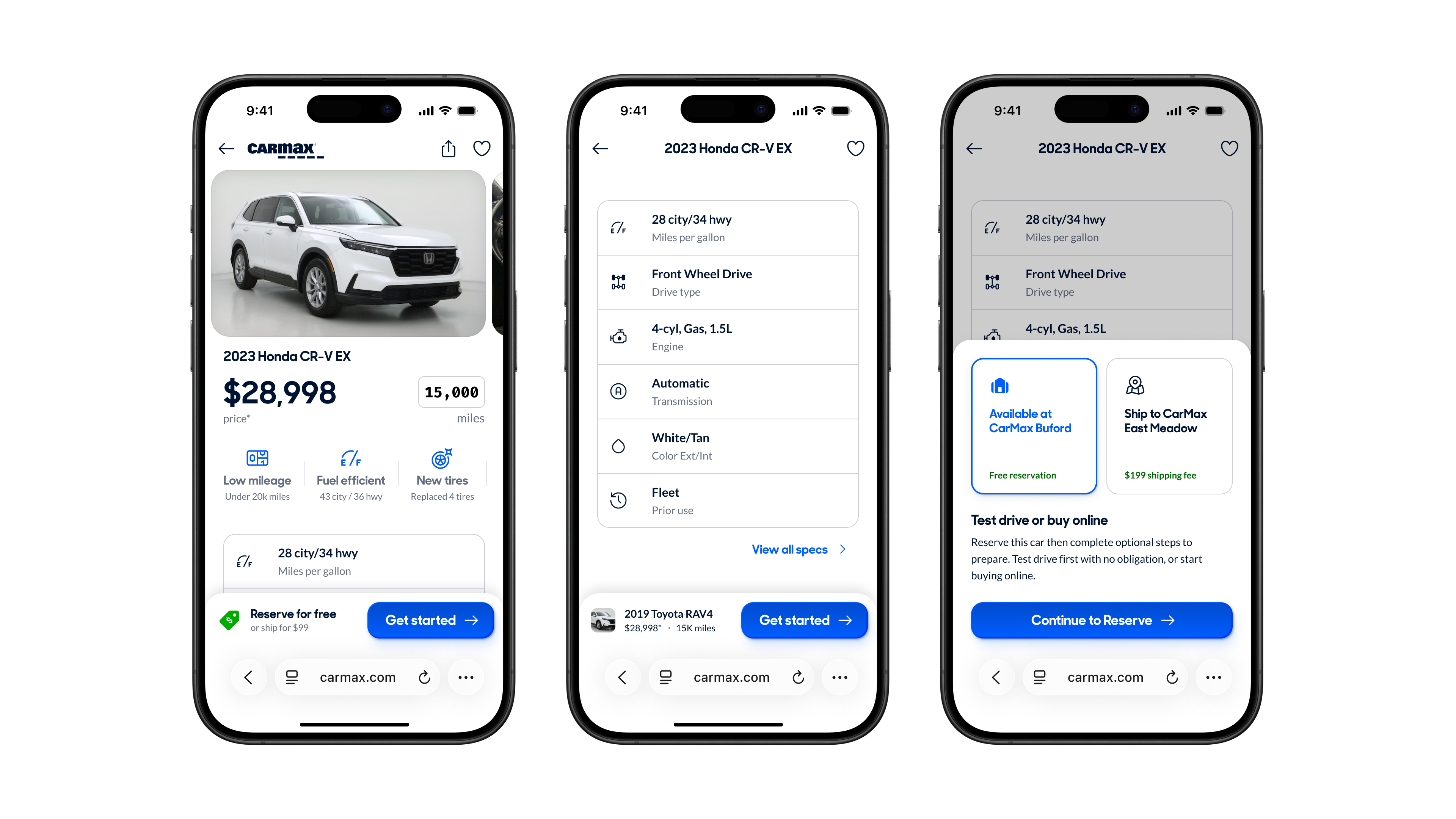
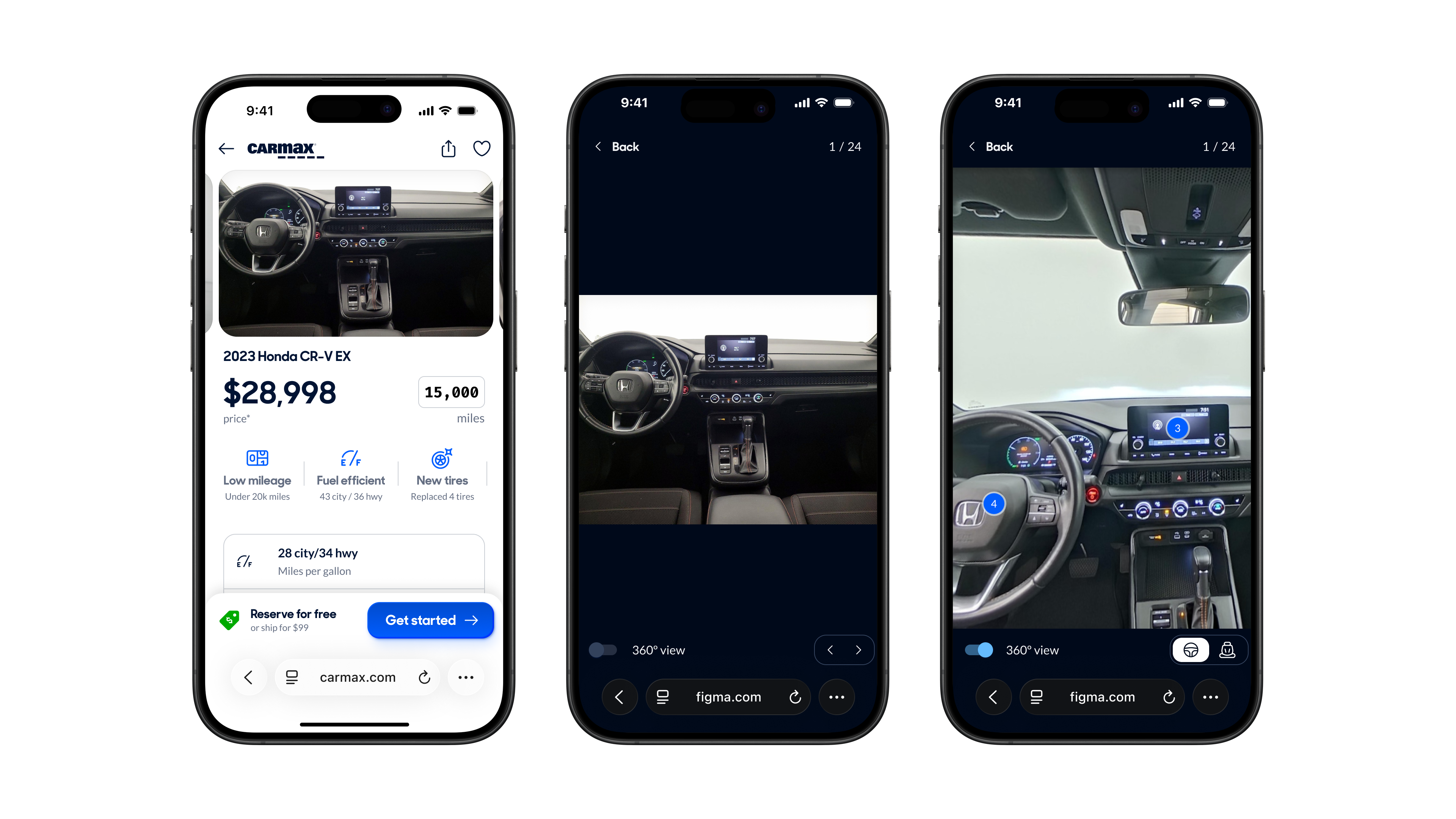
Hero & Image Carousel
Heatmaps showed the dashboard and exterior images were tapped far more than anything else—people want to see the condition of a used car. This let me simplify the image carousel: instead of a dual-row grid maximizing thumbnails, I used a single-row swipeable carousel since the first two images were by far the most important. I also moved the car image above the title and price as a visual anchor and for emotional impact: you see the car first.
Gallery Ergonomics
The old gallery wasn't swipeable. I saw dead swipes in the data—people tried to swipe and nothing happened. We have swipeable carousels all over our site, so it's a learned gesture. When I tried to add swiping, I hit a problem: one of the images was a 360 view that required swiping to rotate, which would conflict with navigation. I pulled the 360 out of the image flow entirely and added a toggle to switch modes from any image. If you're looking at the back seat photo and toggle 360 on, it goes to that angle. Toggle off, you're back to the static image. I also made the buttons consistent across every image, as they previously changed depending on the image type.
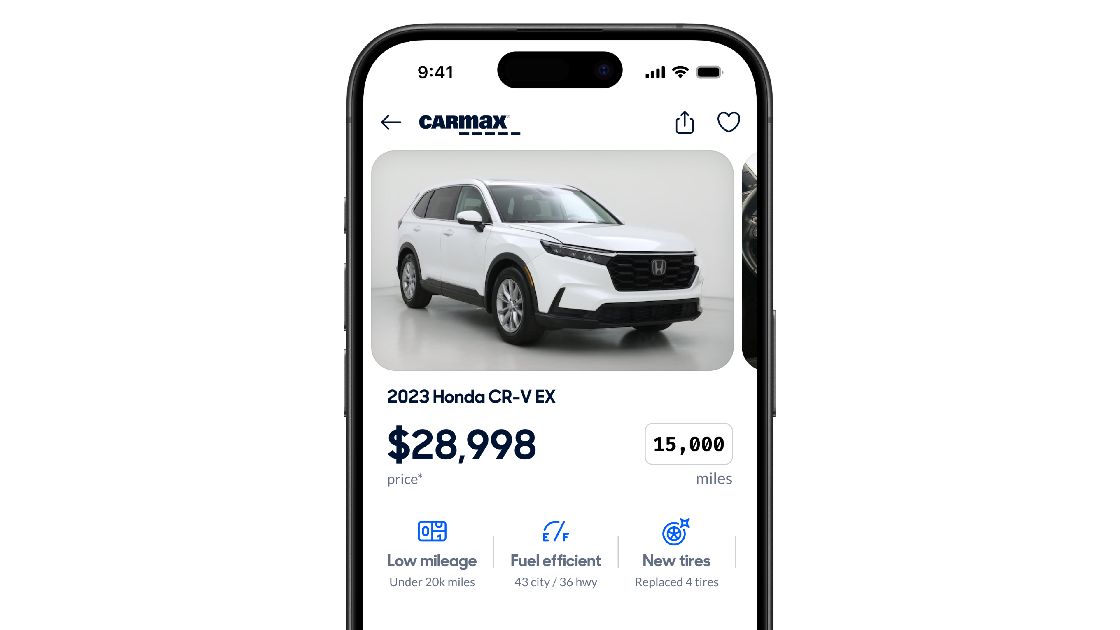
Price, Mileage & Vehicle Highlights
I made the price and mileage bigger. When you're shopping across listings, that's what actually matters. Below the hero, I added a horizontally scrollable row of vehicle highlights—like the App Store's app page treatment.
Page Structure & Legibility
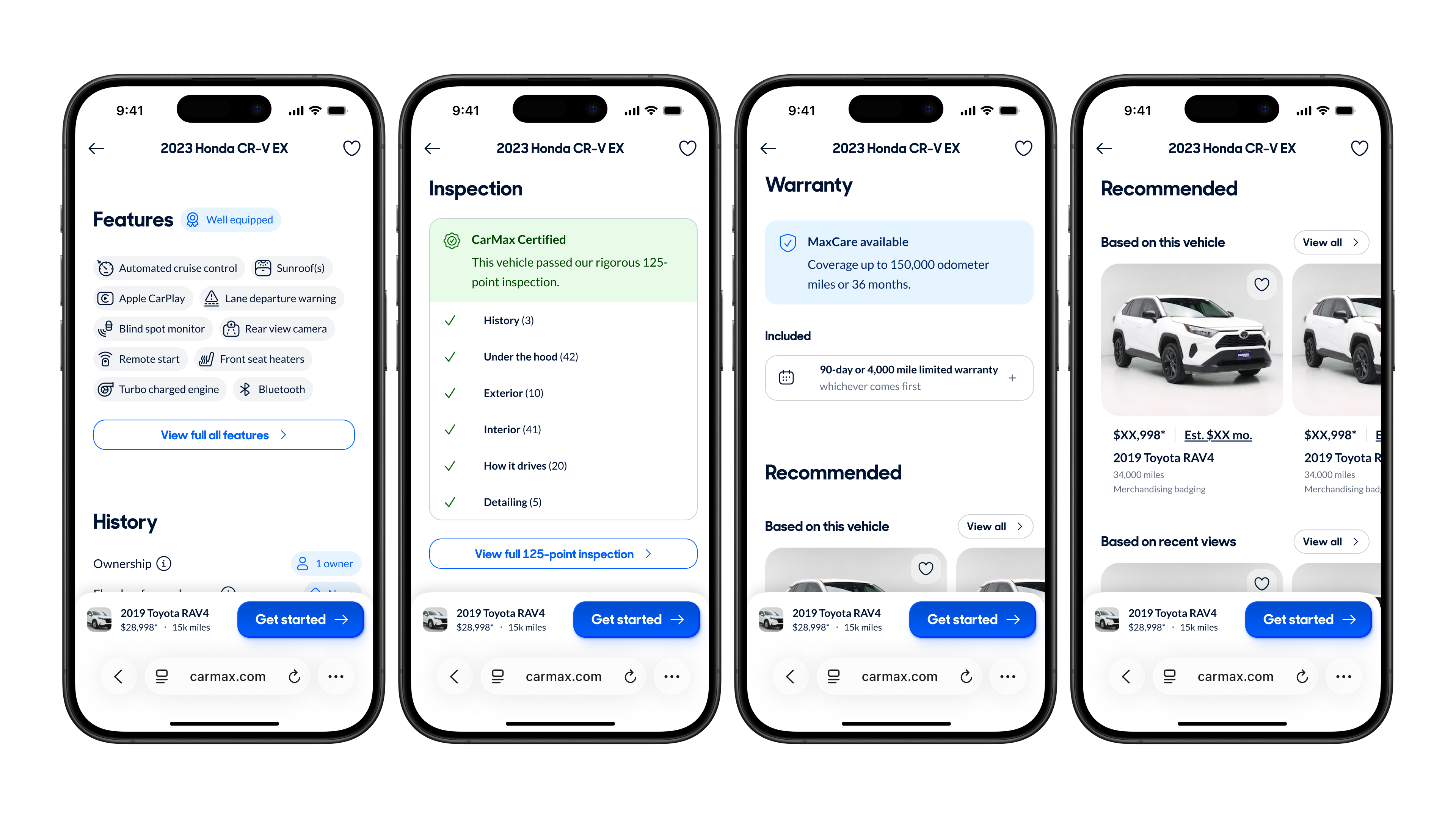
The information architecture was inverted from what users actually care about. Trust signals—damage history, warranty, inspection—were buried at the bottom. Low-value stuff like the feature score and likes/saves took up prime real estate. Only 40% of users scroll past the overview, so I reordered everything: identity and confidence stuff first, then car details, then logistics. I balanced user priority with salesmanship—you don't want to lead with negatives, but you can't hide car history either. I used consistent heading sizes and spacing throughout, replaced custom layouts with design system components, and added icons to the features and specs for easier scanning. I removed low-value sections entirely: the feature score nobody understood, the reviews section that was broken.
Conclusion
User testing validated the direction. Testers "quickly spotted price, mileage, key details in logical order"—exactly what I was going for. The image carousel was "intuitive and functional." The vehicle history section was "easily discoverable." Testers flew through the click tests, averaging under 3 seconds to find any piece of content on the page. For contrast, users described the existing page as "overwhelming" and called some sections "unnecessary and cheesy." The team response was strong too. My PM said it looked "so much better" on mobile and asked to have me join the team full-time: "He knocks stuff out fast and thoughtfully." The team wanted a Big Bang release—ship it all at once—because they were confident in the direction. What people kept coming back to was that every decision was tied to data, not opinions. The project was absorbed into a larger site-wide redesign. The simplified header and top-anchored image made it into the final version, though other designers were exploring similar directions.